In 1972, the first home video game console entered the market, jumpstarting an entertainment industry that would span the next 50 years. That's a long time, especially in the consumer technology world. In fact, video games have been around so long that experts group the various systems into “generations,” segmented eras that categorize consoles that share the same space in the competitive market. As a result, console manufacturers must quickly snag a potential buyer, and the worm on the hook is typically aesthetics.
Aesthetics are everything when selling a product. Looking back on these machines is like opening a time capsule and seeing how trends evolved. Is a console a kid's toy? Is it a home version of an arcade cabinet? Is it something positioned toward adults?
Let's take a look back at the video game consoles with looks that aged like fine wine, and the ones that were huge misfires. Due to changing trends, we'll pick a winner and loser per console generation. Where does your favorite system fall?
Our Current Favorite Gaming Consoles
Nintendo Switch - OLED Model Review
4.5 Outstanding $349.99 at Nintendo See It (Opens in a new window)Microsoft Xbox Series X Review
4.0 Excellent $499.00 at Amazon See It (Opens in a new window)Sony PlayStation 5 Review
4.0 Excellent $519.00 at Amazon See It (Opens in a new window)Gen 1 (1972-1980)
Best Looking: Magnavox Odyssey (1972)
The Magnavox Odyssey was the first home game system, yet it resembles contemporary consoles like the PlayStation 5 and Xbox Series S. Sure, the wooden trim and odd controller reveal the machine's age, but it looks tasteful and evokes “the future.”
Worst Looking: Coleco Telstar Arcade (1977)
From its puffy triangle shape to its questionable shade of brown, the Coleco Telstar Arcade is a visual mess. This extends to its game cartridges, tacky triangles that you flatly inserted into the console's center. The UFO-shaped Telstar Arcade’s mission statement makes a bit more sense (kinda) when you watch its commercial.
Gen 2 (1976-1982)
Best Looking: Atari 2600 (1977)
The trendsetting Atari 2600 is another retro gaming console that looks fairly modern versus the competition. The machine sits in a black tray secured by long, thin columns that run along its width. The wood panels are a touch outdated, but they pull the design together along with the perfectly placed, white Atari logo. You inserted cartridges via the console's top, a trend that continued for years to come.
Worst Looking: Vectrex (1983)
Similar to the Coleco Telstar Arcade, the Vectrex attempts to replicate an arcade machine in your home. In fact, the Vectrex resembles a mini arcade cabinet, and was marketed as a way for people to play games without a television. In terms of ergonomics, it's a well-designed, compact machine. The controller fits snugly into the console when not in use, and integrated handles let you transport it from place to place. However, the Vectrex isn’t the prettiest machine, lacking the color and flair of a full-size arcade cabinet. It's simply a giant, oddly shaped TV.
Gen 3 (1983-1991)
Best Looking: Nintendo Entertainment System (1985)
The Nintendo Entertainment System (or NES) is one of the most iconic pieces of hardware in gaming history. The console's two-tone gray color scheme and black accents are juxtaposed perfectly with the bold red of the company logo. Its cartridges visually match the machine, a smart choice that subtly teaches you how to insert a game. In a nice touch, the NES uses a cassette-like game loader that is secured with a door, leaving the overall shape of the console unchanged.
Worst Looking: View-Master Interactive Vision (1988)
The View-Master Interactive Vision was an edutainment console that hooked up to a VCR and played VHS-based games based on children’s shows, such as The Muppet Show and Sesame Street. It’s an odd design; the console resembles two different pieces of hardware that were smashed together. The taller of the pieces has small circles that resemble air vents, and along the sides are…log-shaped bumps? The controller looks like a fishing rod with a large conical joystick. It's pure chaos.
Gen 4 (1987-1996)
Best Looking: Super Nintendo (1991)
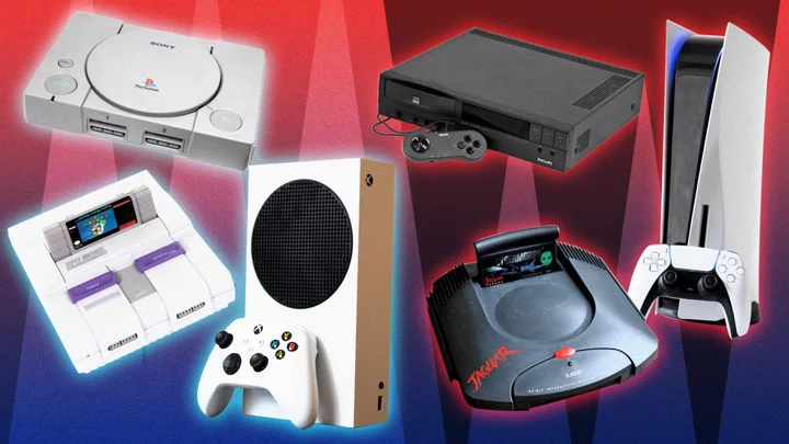
Nintendo’s follow-up to the NES no longer housed cartridges in its body; you inserted them via the top, similar to the Atari 2600. Nintendo doubles down on its boxy aesthetic with bold shades of purple as the machine's power and reset buttons. The box-like design doesn't extend to the controller. The gamepad's rounded base fits comfortably in hand, unlike the relatively sharp, square corners of the NES. Although the SNES isn't as groundbreaking as its older sibling, it sells the iconic Nintendo aesthetic.
Worst Looking: Philips CD-i 220 (1991)
Philips’ line of CD-i consoles was an attempt to make a multimedia home entertainment system that played movies, music, and games, all in the form of the recently created compact disc. Sound familiar? The 220 model was part of Philips' second console series, and it resembled a VHS player. Later CD-i versions would look a bit more like a traditional console, and feature a few licensed Nintendo games that are not fondly remembered. Despite being technologically interesting, the machine looks dated by today’s standards.
Gen 5 (1993-2001)
Best Looking: Sony PlayStation (1995)
A disc-based console born from a failed partnership between Sony and Nintendo, the PlayStation made such a splash that Sony remains one of the three biggest console manufacturers to this day. Aesthetically, the machine has a clean design. It's another box-shaped device, but with a large circle in its center showcasing the console’s boldest feature: a disc drive. The console’s design brilliance lies in its simplicity: a single shade of gray, made of squares and circles. More important, its classic controller has barely changed in almost 30 years.
Worst Looking: Atari Jaguar (1994) and Atari Jaguar CD (1997)
One of the earliest fifth-generation consoles, the Atari Jaguar looks cheap, with its round shape and “fins” that flare toward the back. Plus, its logo is one of the tackier 1990s font choices. Worse, the controller is a nightmare that features a direction pad and three buttons above a full keypad. Three years later, in an attempt to catch up to the competition, Atari released an attachment: a disk drive called the Atari Jaguar CD that resembles a toilet bowl. Once you see it, it cannot be unseen.
Gen 6 (1998-2006)
Best Looking: Nintendo GameCube (2001)
The name and the design perfectly embody the mission statement: This cube plays games. It’s boxy, it’s simple, it’s clean, and it’s purple. The GameCube is the culmination of every smart design decision from the previous 30 years of home consoles, despite the bizarre handle attached to its backside. Likewise, the GameCube’s controller looks bonkers until you hold it. To this day, the many fighting game fans in the Super Smash Bros. community refuse to play with anything else. The GameCube feels like 2001, but like the Magnavox Odyssey, it looks like a device from “the future.”
Worst Looking: Panasonic Q (2001)
Three months after the GameCube's launch, Nintendo and Panasonic created a console that doubled as a DVD player. The Panasonic Q, or The Q, doesn’t look like a video game console. Featuring a mirror panel at the front and a stainless steel, chrome-like body atop four peg legs, The Q resembles a toaster.
Gen 7 (2005-2013)
Best Looking: Nintendo Wii (2006)
The Wii isn’t the best-looking console, but its simplicity made it one of the best-selling video game systems ever made. The box stands vertically or lays horizontally like a traditional DVD player, and the white, glossy finish has an Apple-like vibe. Still, the Nunchuck and Wii remote controllers give the system a toy-like quality that facilitates lasting mainstream appeal.
Worst Looking: Sony PlayStation 3 (2007)
The 11-pound console is a monolithic gaming obelisk. It’s hard to imagine it fitting into anyone’s entertainment unit. Its shape is awkward, like a puffy oval. It features little flair. It also lacks distinguishing features other than a little door that hides additional ports and inputs. On the upside, this futuristic fax machine features the same font as Sony's Sam Raimi Spider-Man movies.
Gen 8 (2012-2020)
Best Looking: Nintendo Switch (2017)
In handheld form, the Nintendo Switch is impossibly thin. It’s light and sleek. When docked, the console looks at home. The console’s versatility is a direct result of its brilliant design. It can be played anywhere. Its modular elements let you separate the controllers from the device so you and your friends can play Mario Party on a rooftop. Unlike all the consoles on this list that try to pull off too much, the Switch merges versatility seamlessly with style.
Worst Looking: Nintendo Wii U (2012)
The Switch looks so good and feels like such a massive victory because it represents a course correction for one of Nintendo’s biggest blunders: the Wii U. Its gamepad is a controller with a screen in its center, and recalls an oddly designed Fisher Price toy. The Wii U’s core ideas live on in the Switch, but this console is memorable for its software, not its looks.
Gen 9 (2020-Present)
Best Looking: Microsoft Xbox Series S (2020)
It is odd that the ninth generation's best-looking console is the least powerful. Microsoft launched two Xbox Series SKUs in 2020, the Xbox Series X (an authentic next-gen console experience) and the Xbox Series S (a machine with less processing power, but a cheaper price point). Aesthetically, the Series S is another system that benefits from years of console iteration. A simple, slim white box with a giant, black, circular vent on one side. Two shapes and two colors, both contrasting and complementing one another. The console isn’t busy with inputs or buttons. It’s clean, it’s perfect, and it’s the best-looking console on this list.
Worst Looking: Sony PlayStation 5 (2020)
There are only three consoles in this current generation, so we had to make a tough decision here. The PlayStation 5’s design is controversial. It looks a little weird. It’s absolutely too big. It also features smartly designed corners, edges, and rounded features. The console isn’t a mess like the other “worst lookers" on this list; its design is purposeful. This same look extends to its controller, the DualSense, the first PlayStation controller to deviate from its core 1995 design. Who knows? In another 50 years it may be the boldest console designs that become the most memorable.
For more, check out The 10 Best Video Game Console Startup Screens.


